With the new year coming-in with its inescapable optimism, I decided to change the look of the blog. It had been same over the last two years and I was looking forward to a fresh look. Being an introvert, I had natural inclination towards minimal blog design with lots of white space & good typography. In the first year, when I had not yet purchased my domain and setup my own hosting, I even used the ‘Manifest‘ theme for its simplicity.
But, when I purchased my domain and server space, I searched for a good minimal theme that fit my budget and settled on Elmastudio, a small webdesign company, that put out some really good WordPress themes. Unable to decide on one, I bought their theme bundle and kept fiddling, moving from one theme to another – Oita to Moka to Cocoa to Namba to Zuki, in search of the ideal look. But, with my pathological dislike towards using images in my posts, none of the themes looked like they were advertised.
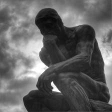
So, I kept looking and after much dilly dallying invested on ‘Genesis’ framework to use their gorgeous themes. I bought the 411 theme, as it provided a way to add a background image without sacrificing the legibility and clarity of words. After using a background image of the thinking man’s statue – a literal representation of the blog’s name, I thought I was set. But, after hearing a lot from friends that my blog looked dull without pictures, I started adding them to articles. Though I was happy with the look, it was not THE look I wanted for the blog.
So, now after 2 years with 411, and a desire to redesign the blog, I decided to go back to the basics – to see if I could nail the look I so wanted and provide the best user experience at the same time. I started with these – what features did I like in some of the blogs I admired? And, as a reader, what were my expectations from one?
- Minimal aesthetic design with lots of white space.
- Gorgeous font.
- Sensible navigation.
- No distractions/clutter – no banners or signup forms or scrolling social icons or the like to disturb me from reading. No cluttered sidebars stuffed with all kinds of information from related posts to featured posts to popular posts to blogging calendars to Twitter timelines.
- Archives – a dedicated place I could visit to see all the posts of the blog in one place.
- Search – a way to search for the content I was looking for.
- Social – easy, always visible – but not in the face – way to subscribe to the blog.
Based on these, I made some changes to the blog:
Theme:
- Before choosing a look, I asked myself a few questions – what is the intent of the blog? If I had to surmise this blog, what would it be? – ‘A shared journal’. Does this intent fit with the look I was aiming for? Yes. I wanted a serene look that encouraged reflection, just like a journal would. A minimalistic design was the right fit.
- Aesthetic design to me was a good theme. Not being a coder, my ability to play with HTML to change the look of the blog was very limited. So, mostly I’d stick with the default look of the blog with a few cosmetic changes. A minimalistic blogging theme that looked almost like how I wanted my blog to look, or which could easily get there, was what I was looking for and, I already had one in mind.
- When I was buying 411, one other theme caught my attention – Wintersong Pro, a theme with minimal & simple design that put focus on – content. So, I didn’t think twice (though I did stop to consider Modern Studio Pro theme for quite sometime), I went ahead and purchased the theme.
Font:
- Once, the theme was setup, one old issue cropped up – fonts. Though google fonts were fabulous, most of the fonts I loved – Open sans, Source sans, Roboto, PT sans, Merriweather sans and Droid sans either looked too light/broken (when the font weight was set to 300) or too thick (when set to 400). Some, even though looked nice on retina devices, fared pretty badly on non-retina devices. Ultimately, I settled on Museo sans after much thought. But, I was still uneasy.
- I wanted a good font, and after much deliberation, I set out to see what were the best fonts available in the market. I visited all the blogs I loved, websites of a few prominent folks and media companies. Of all the fonts I saw, I loved Helvetica Nueue, Proxima Nova, & Whitney. All – paid fonts.
- After researching a lot, I decided to cough up money to signup for Typekit – a font subscription service run by Adobe. This automatically ruled out two of the above fonts for me – Helvetica and Whitney. I happily settled on Proxima Nova.
- Now, with the theme and font in place, the blog looked better than before and closer to how I wanted it to be.
Content:
- Wintersong Pro limited the number of ways I could show content, which was good. Now, I had to be very judicious as to what I wanted to show my reader. To do that, I retraced the steps I’d take when I landed on a new blog/website. I’d generally do one of the three things – visit the ‘about’ page of the author, look at the previous posts or search for some specific ones. This meant, I had to prominently position ‘about’, ‘archives’ & ‘search’ sections on the homepage. Then, if I liked what I read, I’d follow the writer/blog either on social media or through subscription. This meant, social links had to be available at all times to the reader, of course, without being in their face. Next, what would I do if I liked a post? Share it on social media. This meant, social sharing options had to be available at the end of the post.
Others:
- Removed the ‘comments’ section. To be honest, there were hardly any comments posted on the blog and most of my readers follow the blog on Twitter or Facebook, both of which (now) could be used for commenting.
- Removed pictures (again) from my blogposts. I did not see how they were adding value to what I had written. If they were not enhancing the content in anyway, why have them?
- Removed option to follow blog via RSS, as after four years, I didn’t have even one feed subscriber.
- Decided to close down my Google + blog page, as I did not have enough unique things to say on each platform.
- Added a way to navigate between posts without having to go back to the homepage all the time.
After, all these changes, I now officially present to you the new look of my blog. Is this the ‘ideal’ look I was hoping for? Close. Will this look stay? Probably, for now. Will I continue tweaking? Yes. I’m glad that when someone visits the blog, they’ll have nothing to do but to read what I had written. If they decide to stay, it’ll be because of that and if they don’t, it’ll be because of that.
If there is something I learnt in this whole exercise, it is this – minimalism is not cutting down stuff because there is more, but removing fluff till there’s nothing left but the essence.
Hope you like the new look.
Reply